
As more platforms offer dark mode, adapting copy for dark-mode interfaces becomes essential to ensure it is effective and easy to read. On social media, websites, and email campaigns, proper color and typography arrangements help make content more attractive and noticeable even on dark backgrounds. But how can we adapt the copy for this setup without sacrificing readability and visual appeal?
Discover the Secrets of Dark Mode Copywriting
In this article, we will discuss how to adapt copy for dark-mode interfaces to make it more effective and easier to read. From the basic principles of designing copy for dark mode to strategies for choosing colors and typography, we will explore the best ways to maintain readability and visual appeal. We will also emphasize common mistakes to avoid and provide examples of successful dark-mode copy from popular platforms.
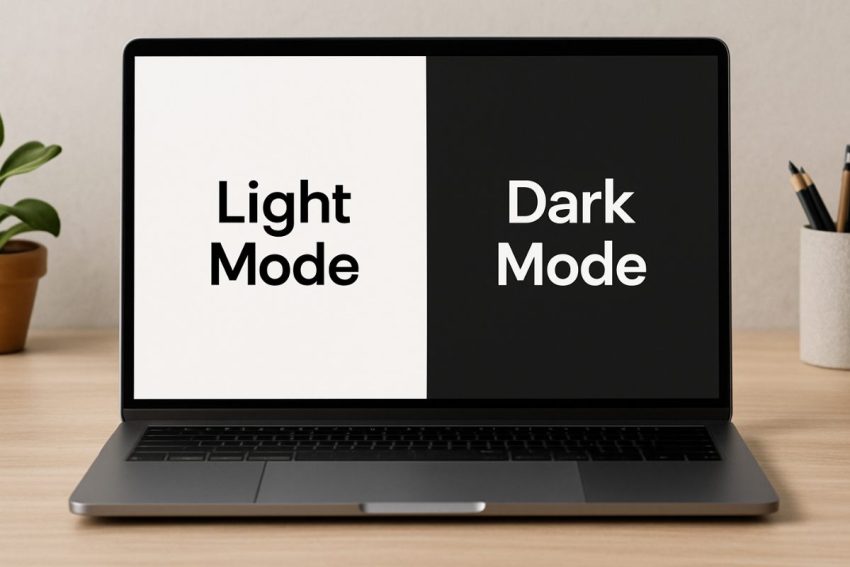
Why Are Dark-Mode Interfaces Important?
With the rise of dark-mode interfaces, it’s not just about aesthetics. Besides protecting the eyes, dark mode also allows for a more modern look for interfaces. But simply changing the background is not enough — the copy must also be properly adapted to avoid readability issues. If the contrast is not correct, the message can get lost in the darkness, or, on the other hand, the reader might be dazzled.
Many users choose dark mode to reduce eye strain, especially when using devices at night. However, dark mode also presents challenges in readability. The right choice of color and contrast helps ensure the copy remains effective in this setup.
Consider social media platforms like Twitter and Instagram, both of which have dark mode settings. When colors and font weights are not properly adapted, texts can become difficult to read, possibly reducing engagement. Another example is email newsletters with a dark mode option. If the text is too bright against a dark background, the audience might not read it fully.
How Is Copywriting Different for Dark Mode?
In dark mode, the background is darker and the text is brighter. But it’s not just about changing colors. Each visual element has a greater impact due to the contrast created by dark backgrounds. Colors stand out more, so copy needs careful adaptation to avoid eye strain or message loss. It is important to consider the contrast between text and background. If text color is too bright, it may cause eye strain; if too dark, it may be hard to read.
Choose fonts with sufficient weight and clarity to ensure they are clear in dark mode. For example, sans-serif fonts like Arial and Roboto are commonly used due to their clean and readable style. Also, avoid excessive use of italicized or bold text unless necessary.
Proper use of spacing is critical. In dark mode, gaps between lines and phrases are more noticeable. Make sure there is enough white space to prevent visual fatigue.
Principles for Adapting Copy for Dark Mode
In dark mode, elements appear brighter, making white space and negative space more noticeable. This is important to give the eyes a rest between lines of text, helping avoid visual fatigue, especially during long reads.
Use short sentences and direct statements to avoid clutter. Instead of long paragraphs, break text into shorter, easier-to-read sections. A simple tone is more effective in this setup because readers understand it faster.
For call-to-action (CTA) buttons, ensure there is enough contrast between the text and background. Using soft shades like off-white or light grey (#E0E0E0) is better than pure white because it is easier on the eyes against dark backgrounds. Also, choose button colors that are visible but not too intense to maintain the overall visual balance of the interface.
Strategies for Effective Copy in Dark Mode
Adopting dark mode means not just changing background colors. Text colors and layout must be adjusted to maintain reading comfort and effectiveness.
Choose the Right Colors
Avoid very bright colors like pure white (#FFFFFF) as they can cause eye fatigue, especially during long reading sessions. Instead, use softer shades like off-white or light grey that provide a gentle and non-glare effect on dark backgrounds.
Effective Use of CTA Buttons
For CTA buttons, use contrasting colors that are immediately noticeable to users. For example, soft yellow or muted blue with sufficient contrast against a dark background works better than overly bright colors that can distract or strain the eyes.
Organize Text with Bullet Points
Using bullet points helps break up and make long text easier to read. However, it is also important to limit the number of bullet points to avoid a crowded appearance and maintain interface clarity.
Examples of Effective Copy in Dark Mode
Effective copy in dark mode balances readability and visual comfort, ensuring users can engage with content without strain. Let’s explore some real-world examples from popular platforms that have successfully adapted their copy for dark-mode interfaces.
Facebook Messenger
Its dark mode uses soft white text on a #121212 background. The layout is simple but effective to avoid dazzling users while maintaining clear message visibility.
Spotify App
The dark mode employs muted green CTA buttons against a black background. These buttons are easy to spot without causing eye strain, creating a balanced visual appeal focused on content.
E-commerce sites like Amazon
They use dark mode to highlight products without distracting users. Subtle shadows and soft contrasts make browsing pleasant even with a dark theme.
Mistakes to Avoid in Dark Mode Copywriting
When adapting copy for dark-mode interfaces, it’s important to know common mistakes to prevent damage to readability and user experience.
Avoid Overly Bright Colors
Text colors that are too bright, such as pure white or overly vivid hues, can hurt users’ eyes on dark backgrounds. It’s better to use softer colors to maintain reading comfort.
Don’t Use Too Small Font Sizes
Very small fonts make reading difficult, especially in dark mode, where low visibility can compound the problem. Make sure fonts are large enough for easy reading.
Limit Bold Text Usage
Excessive bold text can make the interface look cluttered and create an overwhelming visual hierarchy. Use bold only for important statements or CTAs to focus the reader’s attention.
Adjust Hyperlink Design
Avoid using overly bright or intense blue colors for hyperlinks. Softer shades are better, so links don’t become distracting or overpowering in the dark interface.
Testing and Optimizing Dark Mode Copy
A/B testing is an effective way to determine which copy adaptations work best for dark mode. Use user feedback to identify parts that are hard to read or too bright, and to understand how color and font choices affect engagement and retention.
Also, track analytics such as click-through rates and time spent on the page to measure the success of dark mode adaptations. By continually updating and adjusting copy based on data, content can remain effective and accessible to all users, even in dark mode.
Try different combinations of color, typography, and spacing to find the best setup that not only enhances visual appeal but also increases user satisfaction and interaction.